Scientist of the Day - John Emslie

Prehistoric animals of the Oolite and Lias systems, detail of “The Antediluvian World”, hand-colored engraved chart by John Emslie, in James Reynolds, Diagrams Illustrating the Sciences of Astronomy and Geography, 1844-50 (Linda Hall Library)
John Emslie, an English illustrator and engraver, was born July 21, 1813. We know little about Emslie's life, other than that his children and grandchildren were all illustrators or miniature painters. What we do know about Emslie is that he drew and engraved a variety of scientific charts, usually in partnership with a printer/publisher, James Reynolds. These charts were primarily astronomical, geological, and geographical, but there were few sciences that escaped his chartmanship. The ones I am familiar with are all relatively small (for charts), about the size of a sheet of typing paper, but on stiffer stock, and they were issued in small portfolios of 10 to 20 charts. We have nine of these by Reynolds in our collections, with titles like Astronomical Diagrams, Astronomical and Geological Diagrams, or Diagrams of Arts, Sciences, and Manufactures; most were published between 1844 and 1854, although there are several later collections. Since the plates were not bound in, or numbered, it is hard to tell what plates are supposed to be in what folder, and there is some repetition between different titles. I am guessing that institutions with the same portfolio slipcases may well have different collections of plates in them.


Front cover, James Reynolds, Diagrams Illustrating the Sciences of Astronomy and Geography, 1844-50 (Linda Hall Library)
I had one of these small folios scanned for today's post, a folder called Diagrams Illustrating the Sciences of Astronomy and Geography (1844; second image). This has 15 plates loosely inserted within the covers, one being a duplicate. Not all of the plates are signed, and although we are told that they were all executed by Emslie, I chose only those that actually carry his signature. Most of the astronomical charts are not signed (although see below for an exception), so the charts shown here are either geological or historical.

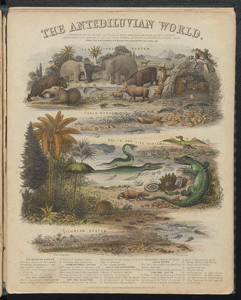
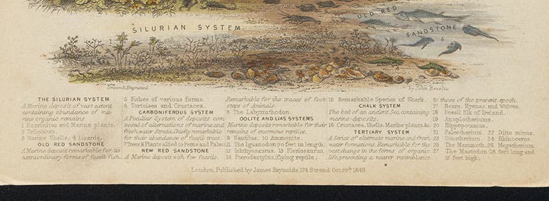
“The Antediluvian World”, hand-colored engraved chart by John Emslie, in James Reynolds, Diagrams Illustrating the Sciences of Astronomy and Geography, 1844-50 (Linda Hall Library)

“Drawn and engraved by John Emslie,” signature at bottom of third image, James Reynolds, Diagrams Illustrating the Sciences of Astronomy and Geography, 1844-50 (Linda Hall Library)
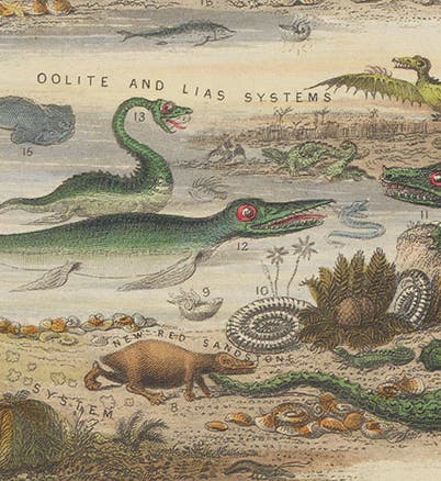
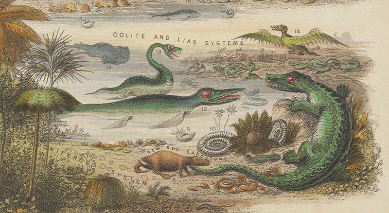
One of the charts signed by Emslie is titled “The Antediluvian World,” and it depicts the animal and plant life of the Tertiary period at the top, with scenes from the Chalk (Cretaceous), Oolite and Lias (Jurassic) and Silurian below (third image). It says at the top that the chart is based on the work of Buckland, Cuvier, Mantell, and Lyell, all of whom we have profiled in other posts. We show a detail of the dinosaurs discovered by Buckland and Mantell as our first image. In our fourth image, a detail of the bottom of the chart, you can see how the engraving is signed: "Drawn and engraved by John Emslie."

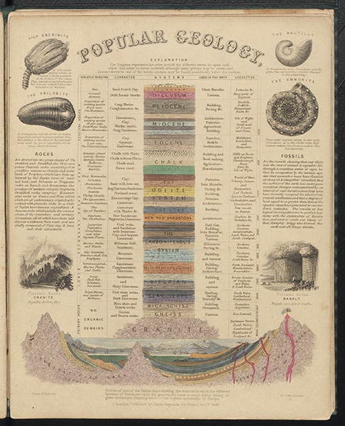
“Popular Geology”, hand-colored engraved chart by John Emslie, in James Reynolds, Diagrams Illustrating the Sciences of Astronomy and Geography, 1844-50 (Linda Hall Library)

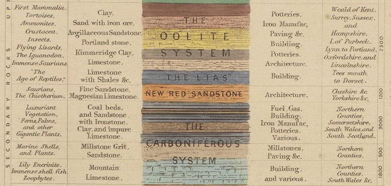
“The Oolite system and the Lias,” detail of fifth image, James Reynolds, Diagrams Illustrating the Sciences of Astronomy and Geography, 1844-50 (Linda Hall Library)
Another chart is called “Popular Geology,” and it has, in addition to more than the usual amount of text, a geological column in the center, and a section of the earth's crust below, both remarkably detailed (fifth image, above). We include a close-up of the Oolite and Lias section of the geological column, where you can make out the terms "Iguanodon" and "immense saurians" on the left (sixth image, just above).

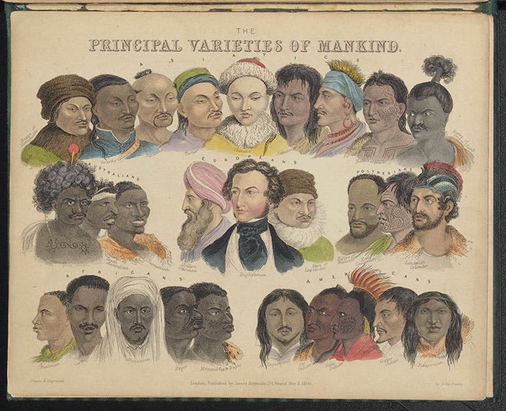
“The Principal Varieties of Mankind,” hand-colored engraved chart by John Emslie, in James Reynolds, Diagrams Illustrating the Sciences of Astronomy and Geography, 1844-50 (Linda Hall Library)
There is also a chart called "The Principal Varieties of Mankind" (seventh image, above). If we forgive (or at least ignore) the placement of an "Englishman" in the preferred position of front and center, this is a relatively benign portrayal of the (male) varieties of Asian, Australian, Polynesian, European, African, and American peoples to be found around the globe.

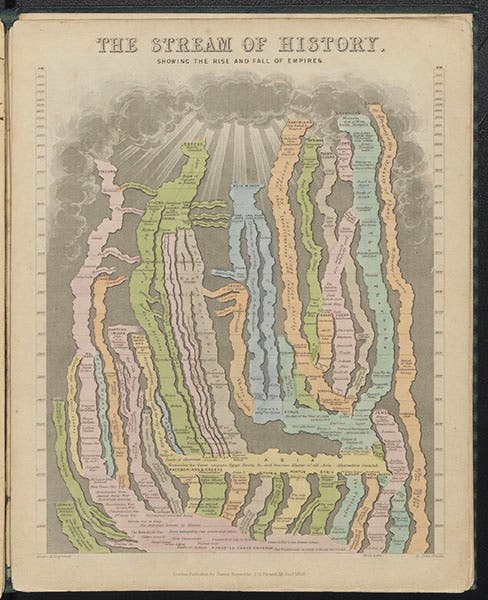
“The Stream of History,” hand-colored engraved chart by John Emslie, in James Reynolds, Diagrams Illustrating the Sciences of Astronomy and Geography, 1844-50 (Linda Hall Library)

Alexander the Great conquers much of the world, detail of eighth image, in James Reynolds, Diagrams Illustrating the Sciences of Astronomy and Geography, 1844-50 (Linda Hall Library)
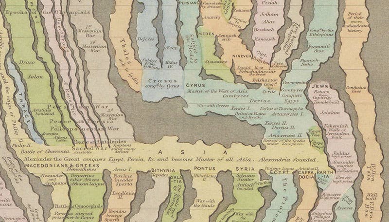
The busiest chart is one called “The Stream of History, Showing the Rise and Fall of Empires” (eighth image, above). This graphs not a stream but a complicated delta of dozens of streams, including Greeks, Babylonians, Assyrians, Persians, Chinese, Egyptian, Jews, and many others. The time scale on the left and right is labelled "AM", or annus mundi, the year of the world. Since Alexander the Great, who died in 323 BCE, is dated at 3670 or so AM, then Emslie subscribed to the view that the world was created about 4000 BCE. Or at least his chart subscribed to that belief. In the detail (ninth image), depicting where Alexander united about 10 streams, you can see the names of Aristotle and Socrates just above Alexander’s name.

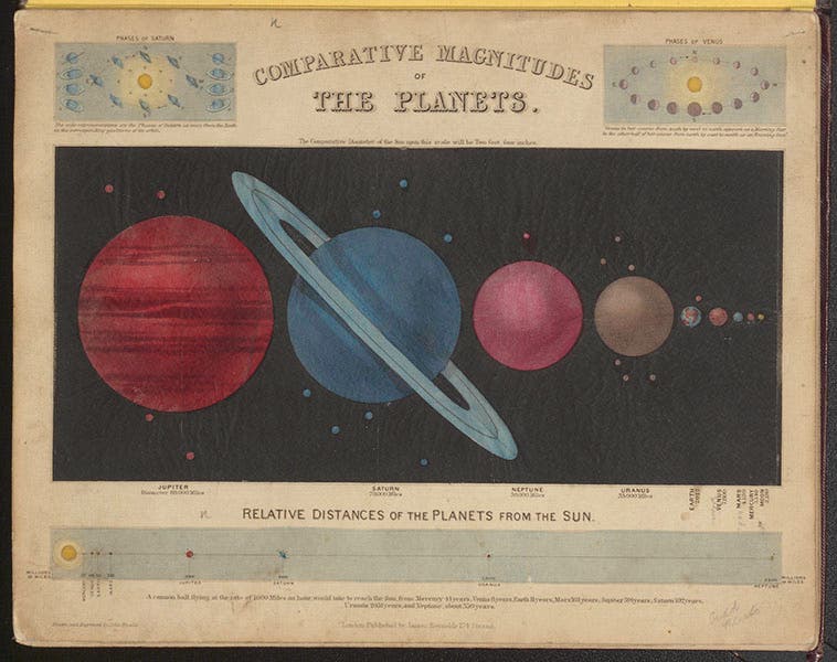
“Comparative Magnitude of the Planets,” hand-colored engraved chart by John Eslie with tissue-covered cut-outs, in James Reynolds, Astronomical and Geographical Diagrams, 1850 (Linda Hall Library)
Our final chart comes from a different Reynolds compilation, with the title: Astronomical and Geographical Diagrams (1850). The chart we show is called “Comparative Magnitude of the Planets,” and it is signed by Emslie (tenth image, above). It depicts the planets to scale, with each planet hand-colored. If you hold the chart up to the light (you can do that, since the charts slip right out of the slipcase), the planets glow in their respective colors. If you turn the chart over (eleventh image, below), you can see why – the planets have been cut out and overlain with translucent tissue paper. The publication of charts like this was a complicated process, but apparently it was very popular with readers, and well worth the additional time and expense.

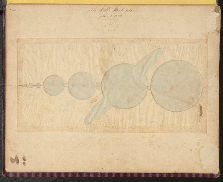
Verso of chart in tenth image, showing cut-outs and tissue overlay, in James Reynolds, Astronomical and Geographical Diagrams, 1850 (Linda Hall Library)
Some day we will write a post on Reynolds, giving us an opportunity to showcase more of Emslie’s artwork from the other compendia of scientific charts in our collections.
William B. Ashworth, Jr., Consultant for the History of Science, Linda Hall Library and Associate Professor emeritus, Department of History, University of Missouri-Kansas City. Comments or corrections are welcome; please direct to ashworthw@umkc.edu.